NEIMAN MARCUS: HOLIDAY EPICURE
A Mirror of What’s Inside
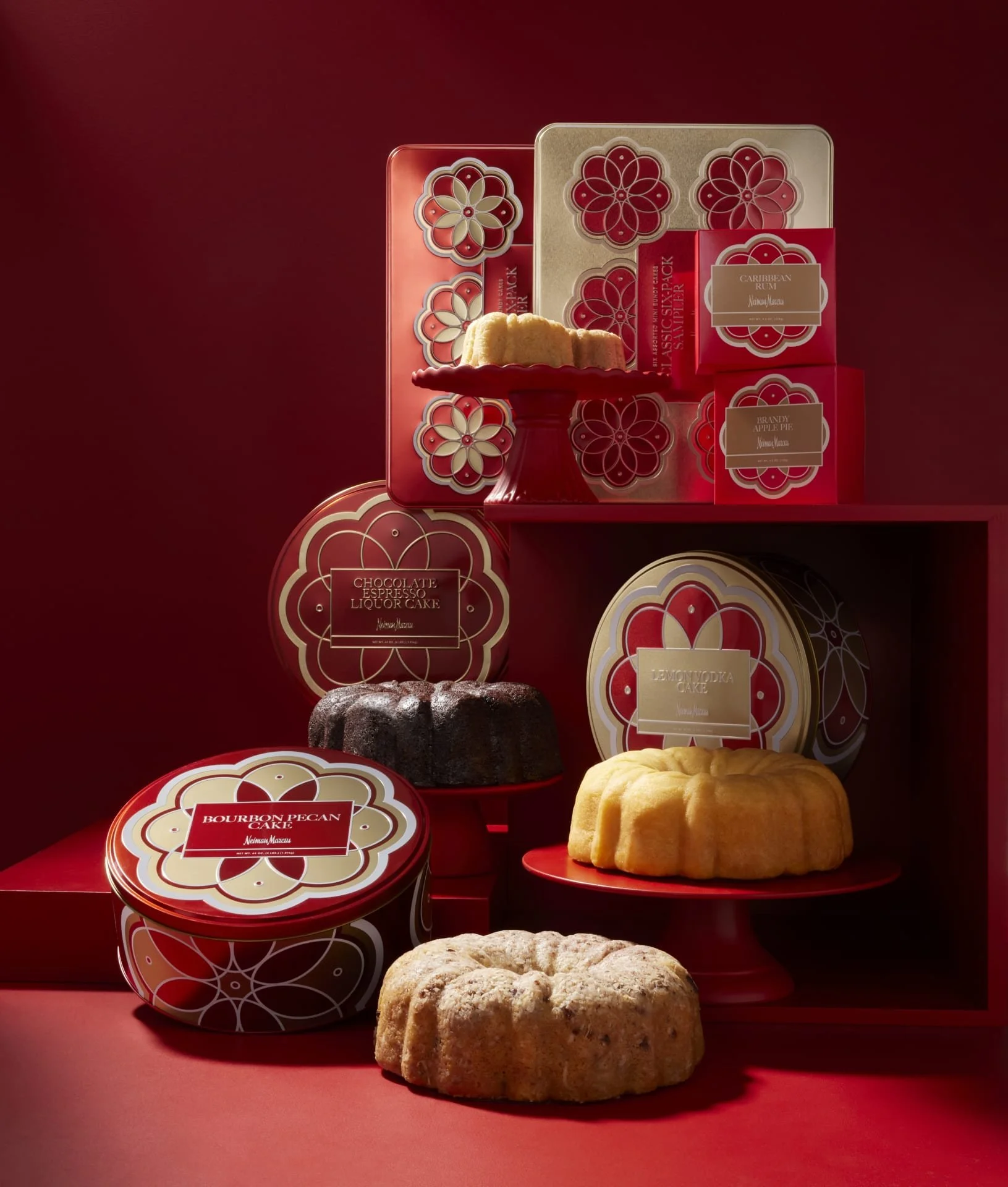
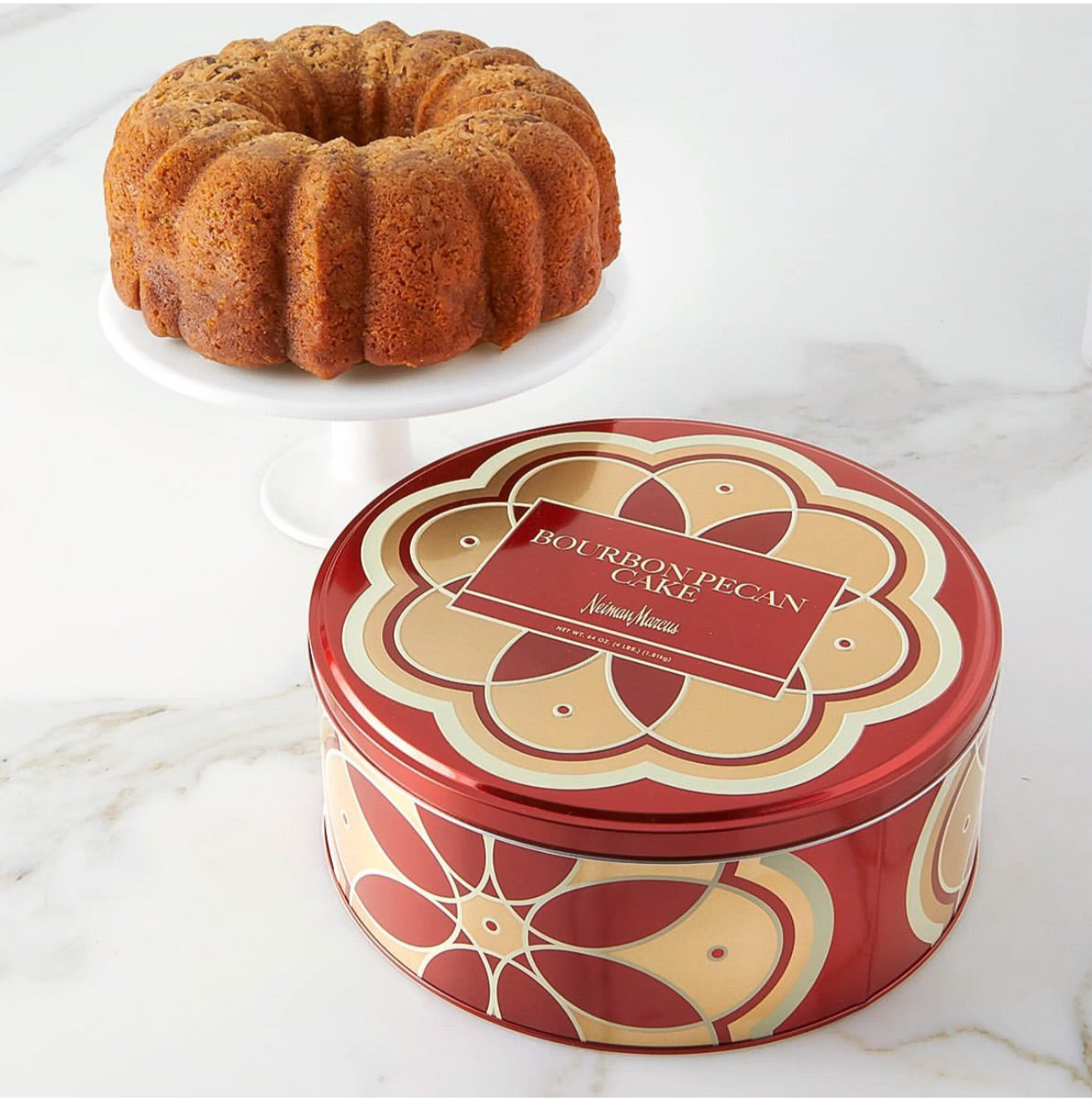
When I was approached by our internal print manager to assist in holiday epicure, I was assigned all variations of liquor cakes (featured in the photo on the left). They are made in a bundt shape so I wanted the design on the outside of the tins to mimic that in a way. Using Adobe Illustrator, I started making the organic shapes that you can see on each tin.
Taking that approach one step further, I wanted the color on each tin to reflect the flavor of the cake inside (lemon vodka is light gold, bourbon pecan a darker burgundy, etc.)
This design remained on liquor cake tins for two consecutive holiday seasons. Below I have added images of the different larger cake tins as well as the multi-flavor packages.